In this discovery exercise lab, we review a problem statement and do the analysis to define the scope of work and requirements.
Problem Statement
In the city of New York, commuters use the Metropolitan Transportation Authority (MTA) subway system for transportation. There are millions of people that use this system every day; therefore, businesses around the subway stations would like to be able to use Geofencing advertisement to target those commuters or possible consumers and attract them to their business locations at peak hours of the day.
Geofencing is a location based technology service in which mobile devices’ electronic signal is tracked as it enters or leaves a virtual boundary (geo-fence) on a geographical location. Businesses around those locations would like to use this technology to increase their sales.

The MTA subway system has stations around the city. All the stations are equipped with turnstiles or gates which tracks as each person enters or leaves the station. MTA provides this information in CSV files, which can be imported into a data warehouse to enable the analytical process to identify patterns that can enable these businesses to understand how to best target consumers.
Analytical Approach
Dataset Criteria
We are using the MTA Turnstile data for 2023. Using this data, we can investigate the following criteria:
- Stations with the high number of exits by day and hours
- Stations with high number of entries by day and hours
Exits indicates that commuters are arriving to those locations. Entries indicate that commuters are departing from those locations.
Data Analysis Criteria
The data can be grouped into stations, date and time of the day. This data is audited in blocks of fours hours apart. This means that there are intervals of 8am to 12pm as an example. We analyze the data into those time block intervals to help us identify the best times both in the morning and afternoon for each station location. This should allow businesses to target a particular geo-fence that is close to their business.
In the discovery process, we take a look at the data that is available for our analysis. We are using the MTA turnstiles information which is available at this location:
👉 New York Metropolitan Transportantion Authority Turnstile Data
We can download a single file to take a look at the data structure and make the following observations about the data:
Observations
- It is available in weekly batches every Sunday
- The information is audited in blocks of fours hours apart
- The date and time field are on different columns
- The cumulative entries are on the ENTRIES field
- The cumulative exits are on the EXITS field
- This data is audited in blocks of fours hours apart

Field Description
| Name | Description |
|---|---|
| C/A | Control Area (A002) (Booth) |
| UNIT | Remote Unit for a station (R051) |
| SCP | Subunit Channel Position represents an specific address for a device (02-00-00) |
| STATION | Represents the station name the device is located at |
| LINENAME | Represents all train lines that can be boarded at this station. Normally lines are represented by one character. LINENAME 456NQR repersents train server for 4, 5, 6, N, Q, and R trains. |
| DIVISION | Represents the Line originally the station belonged to BMT, IRT, or IND |
| DATE | Represents the date (MM-DD-YY) |
| TIME | Represents the time (hh:mm:ss) for a scheduled audit event |
| DESc | Represent the “REGULAR” scheduled audit event (Normally occurs every 4 hours). Audits may occur more that 4 hours due to planning, or troubleshooting activities. Additionally, there may be a “RECOVR AUD” entry: This refers to missed audit that was recovered. |
| ENTRIES | The cumulative entry register value for a device |
| EXIST | The cumulative exit register value for a device |
Data Example
The data below shows the entry/exit register values for one turnstile at control area (A002) from 09/27/14 at 00:00 hours to 09/29/14 at 00:00 hours
| C/A | UNIT | SCP | STATION | LINENAME | DIVISION | DATE | TIME | DESC | ENTRIES | EXITS |
|---|---|---|---|---|---|---|---|---|---|---|
| A002 | R051 | 02-00-00 | LEXINGTON AVE | 456NQR | BMT | 09-27-14 | 00:00:00 | REGULAR | 0004800073 | 0001629137 |
| A002 | R051 | 02-00-00 | LEXINGTON AVE | 456NQR | BMT | 09-27-14 | 04:00:00 | REGULAR | 0004800125 | 0001629149 |
| A002 | R051 | 02-00-00 | LEXINGTON AVE | 456NQR | BMT | 09-27-14 | 08:00:00 | REGULAR | 0004800146 | 0001629162 |
Conclusions
Based on observations, the following conclusions can be made:
- Merge the DATE and TIME columns and create a date time column, CREATED
- The STATION column is a location dimension
- The CREATED column is the datetime dimension to enable the morning and afternoon timeframes
- The ENTRIES column is the measure for entries
- The EXITS column is the measure for exits
- A gate can be identified by using the C/A, SCP and UNIT columns
Requirements
These observations can be used to define technical requirements that can enable us to deliver a successful project.
- Define the infrastructure requirements to host the technology
- Automate the provisioning of the resources using Terraform
- Deploy the technology on a cloud platform
- Define the data orchestration process
- On the original pipeline, load the initial data for 2023
- Create a data pipeline that runs every week after a new file has been published
- Copy the unstructured CSV files into a Data Lake
- Define a well-structured and optimized model on a Data Warehouse
- Keep the source code for the models under source control
- Copy the data into the Data Warehouse
- Allow access to the Data Warehouse, so visualization tools can consume the data.
- Create Data Analysis dashboard with the following information
- Data Analysis dashboard
- Identify the time slots for morning and afternoon analysis
- Look at the distribution by stations
- Look at the daily models
- Look at the time slot models
Review the Code
In order to do our data analysis, we need to first download some sample data by writing a Python script. We can the analyze this data by writing some code snippets and use the power of the Python Pandas library. We can also use Jupyter Notebooks to quickly manipulate the data and create some charts that can help us as baseline requirements for the final visualization dashboard.
👉 Clone this repo or copy the files from this folder
Download a CSV File from the MTA Site
With this Python script (mta_discovery.py), we download a CSV file with the URL of http://web.mta.info/developers/data/nyct/turnstile/turnstile_230318.txt. The code creates a data stream to download the file in chunks to avoid any timeouts. We append the chunks into a local compressed file to reduce the size of the file. In order to reuse this code, we use the command line parser, so we can pass as parameters the URL.
import os
import argparse
from time import time
from pathlib import Path
import pandas as pd


def read_local(file_path: str) -> Path:
    """
        Reads a local file
        Args:
            file_path:  local file
    """
    print(F'Reading local file {file_path}')
    df_iter = pd.read_csv(file_path, iterator=True,compression="gzip", chunksize=10000)
    if df_iter:
        for df in df_iter:
            try:
                print('File headers',df.columns)
                print('Top 10 rows',df.head(10))
                break
            except Exception as ex:
                print(f"Error found {ex}")
                return

        print(f"file was loaded {file_path}")
    else:
        print(F"failed to read file {file_path}")

def write_local(df: pd.DataFrame, folder: str, file_name: str) -> Path:
    """
        Write DataFrame out locally as csv file
        Args:
            df: dataframe chunk
            folder: the download data folder
            file_name: the local file name
    """

    path = Path(f"{folder}")
    if not os.path.exists(path):
        path.mkdir(parents=True, exist_ok=True)

    file_path = Path(f"{folder}/{file_name}")

    if not os.path.isfile(file_path):
        df.to_csv(file_path, compression="gzip")
        print('new file')
    else:
        df.to_csv(file_path, header=None, compression="gzip", mode="a")
        print('chunk appended')

    return file_path

def etl_web_to_local(url: str, name: str) -> None:
    """
       Download a file
       Args:
            url : The file url
            name : the file name

    """
    print(url, name)

    # skip an existent file
    path = f"../data/"
    file_path = Path(f"{path}/{name}.csv.gz")
    if os.path.exists(file_path):
            read_local(file_path)
            return

    df_iter = pd.read_csv(url, iterator=True, chunksize=10000)
    if df_iter:
        file_name = f"{name}.csv.gz"
        for df in df_iter:
            try:
                write_local(df, path, file_name)
            except StopIteration as ex:
                print(f"Finished reading file {ex}")
                break
            except Exception as ex:
                print(f"Error found {ex}")
                return

        print(f"file was loaded {file_path}")
    else:
        print("dataframe failed")

def main_flow(params: str) -> None:
    """
        Process a CSV file from a url location with the goal to understand the data structure
    """
    url = params.url
    prefix = params.prefix

    try:
        start_index = url.index('_')
        end_index = url.index('.txt')
        file_name = F"{prefix}{url[start_index:end_index]}"
        # print(file_name)
        etl_web_to_local(url, file_name)
    except ValueError:
        print("Substring not found")


if __name__ == '__main__':

    os.system('clear')
    parser = argparse.ArgumentParser(description='Process CSV data to understand the data')
    parser.add_argument('--url', required=True, help='url of the csv file')
    parser.add_argument('--prefix', required=True, help='the file prefix or group name')
    args = parser.parse_args()

    print('running...')
    main_flow(args)
    print('end')
Analyze the Data
With some sample data, we can now take a look at the data and make some observations. There are a few ways to approach the analysis. We could create another Python script and play with the data, but this will require to run the script from the console after every code change. A more productive way is to use Jupyter Notebooks. This tools enables us to edit and run code snippets in cells without having to run the entire script. This is a friendlier analysis tool that can help us focus on the data analysis instead of coding and running the script. In addition, once we are good with our changes, the notebook can be exported into a Python file. Let's look at that file discovery.ipynb:
import os
import argparse
from time import time
from pathlib import Path
import pandas as pd

# read the file and display the top 10 rows
df = pd.read_csv('../data/230318.csv.gz', iterator=False,compression="gzip")
df.head(10)

# Create a new DateTime column and merge the DATE and TIME columns
df['CREATED'] =  pd.to_datetime(df['DATE'] + ' ' + df['TIME'], format='%m/%d/%Y %H:%M:%S')
df = df.drop('DATE', axis=1).drop('TIME',axis=1)
df.head(10)

# Aggregate the information by station and datetime
df["ENTRIES"] = df["ENTRIES"].astype(int)
df["EXITS"] = df["EXITS"].astype(int)
df_totals = df.groupby(["STATION","CREATED"], as_index=False)[["ENTRIES","EXITS"]].sum()
df_totals.head(10)

df_station_totals = df.groupby(["STATION"], as_index=False)[["ENTRIES","EXITS"]].sum()
df_station_totals.head(10)

# Show the total entries by station, use a subset of data
import plotly.express as px
import plotly.graph_objects as go

df_stations =  df_station_totals.head(25)
donut_chart = go.Figure(data=[go.Pie(labels=df_stations["STATION"], values=df_stations["ENTRIES"], hole=.2)])
donut_chart.update_layout(title_text='Entries Distribution by Station', margin=dict(t=40, b=0, l=10, r=10))
donut_chart.show()

# Show the data by the day of the week
df_by_date = df_totals.groupby(["CREATED"], as_index=False)[["ENTRIES"]].sum()
day_order = ['Sun', 'Mon', 'Tue', 'Wed', 'Thu', 'Fri', 'Sat']
df_by_date["WEEKDAY"] = pd.Categorical(df_by_date["CREATED"].dt.strftime('%a'), categories=day_order, ordered=True)
df_entries_by_date =  df_by_date.groupby(["WEEKDAY"], as_index=False)[["ENTRIES"]].sum()
df_entries_by_date.head(10)

bar_chart = go.Figure(data=[go.Bar(x=df_entries_by_date["WEEKDAY"], y=df_entries_by_date["ENTRIES"])])
bar_chart.update_layout(title_text='Total Entries by Week Day')
bar_chart.show()
How to Run it!
With an understanding of the code and tools, let's run the process.
Requirements
👉 Install Python, Pandas and Jupyter notebook
👉 Clone this repo or copy the files from this folder
Follow these steps to run the analysis
- Download a file to look at the data
- This should create a gz file under the ../data folder
$ python3 mta_discovery.py --url http://web.mta.info/developers/data/nyct/turnstile/turnstile_230318.txt
Run the Jupyter notebook (dicovery.ipynb) to do some analysis on the data.
- Load the Jupyter notebook to do analysis
- First start the Jupyter server from the terminal
$ jupyter notebook
- See the URL on the terminal and click it to load it on the browser
- Click the discovery.ipynb file link
- Or open the file with VSCode and enter the URL when prompted from a kernel url
- Run every cell from the top down as this is required to load the dependencies
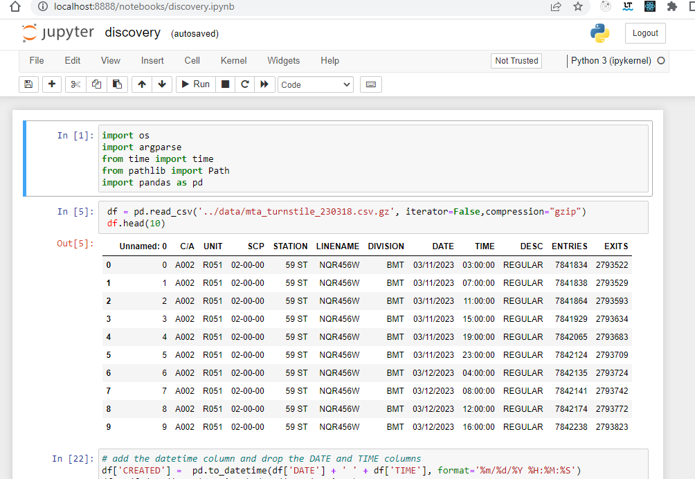
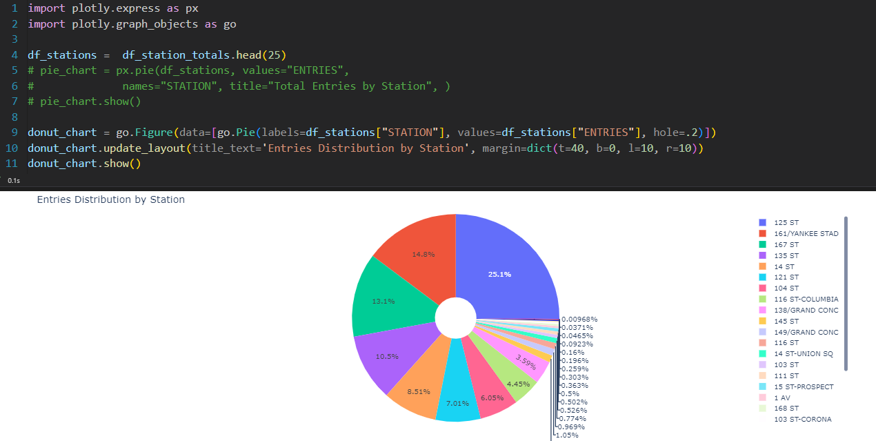
The following images show Jupyter notebook loaded on the browser or directly from VSCode.
Jupyter Notebook loaded on the browser


Using VSCode to load the data and create charts

Show the total entries by station using a subset of data using VSCode

Next Step
👉 Data Engineering Process Fundamentals - Design and Planning
Thanks for reading.
Send question or comment at Twitter @ozkary
👉 Originally published by ozkary.com


0 comments :
Post a Comment
What do you think?